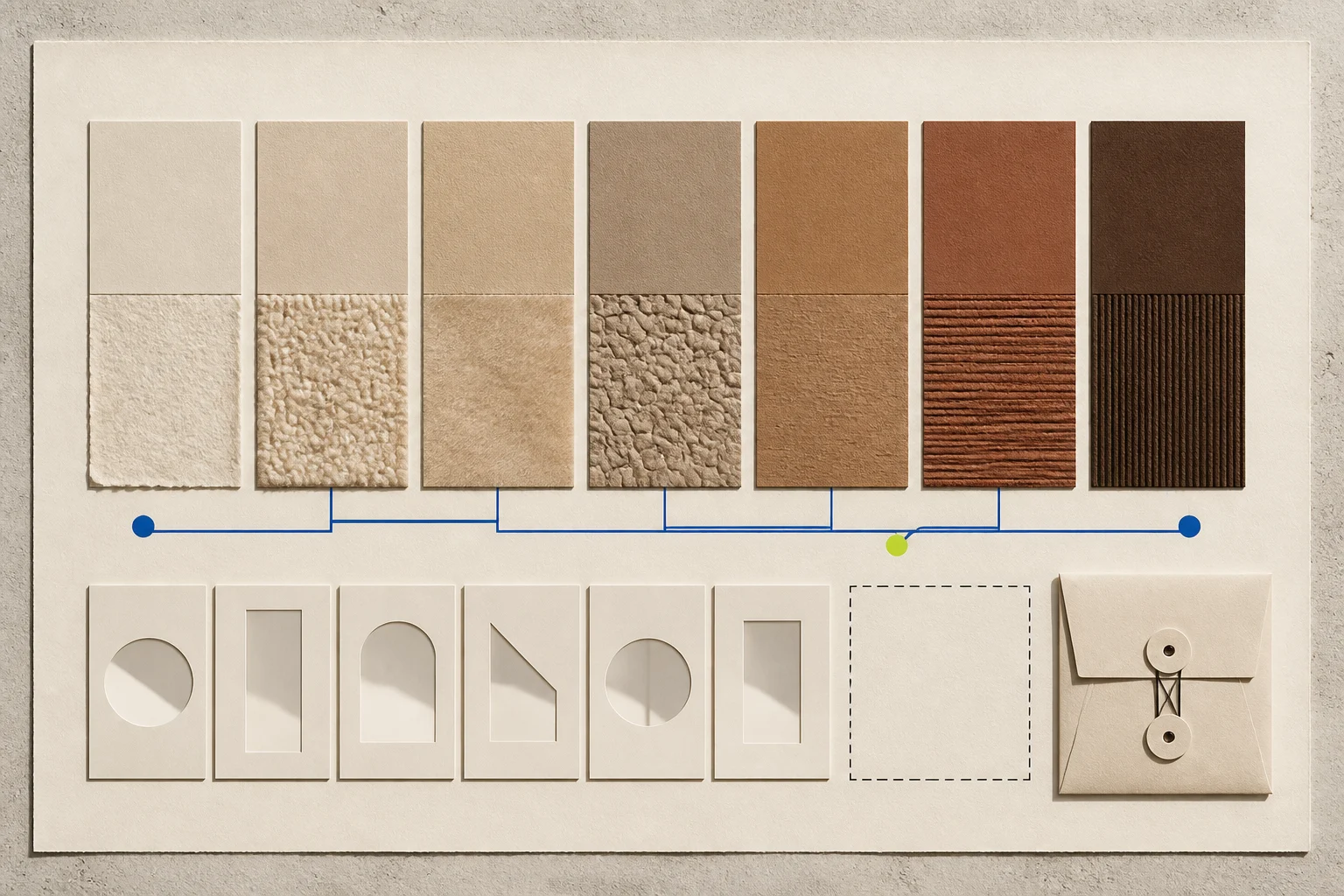
The current neutral vocabulary often sounds tactile: craft beige, ecru, oat, sand, dune, camel, tobacco, stone, raw linen, cream, and softened white. Texture can make a light neutral feel deeper, warmer, or more varied because fibers, shadows, gloss, pile, weave, and open structure change the light that reaches the viewer.
FashionMember reviewed current first-party color and collection materials plus official colorimetry, textile evaluation, product-data, care, advertising, and image guidance. It has not frozen a collection and retail sample, obtained physical standards, measured products, interviewed buyers, or reconciled completed returns and kept sales. This draft builds a testable palette method rather than claiming a verified new neutral market.
Define neutral and warm before coding
“Neutral” is a merchandising category, not one fixed coordinate. The codebook should state which hue, chroma, and lightness ranges are eligible and how black, gray, navy, olive, metallic, undyed, multicolor, and natural-fiber variation are handled. Brand color names should be preserved but mapped separately from the reporter’s standard category.
“Warm” can describe a relative shift toward yellow, orange, or red compared with a declared reference. It can also be a perceptual response to light and neighboring colors. A white fabric beside blue may look warm while the same fabric beside camel looks cool. Report the comparison and conditions.
Texture needs its own variables: smooth, twill, slub, brushed, felted, bouclé, tweed, rib, open knit, lace, raffia, braided, suede-like, glossy, matte, pile, and visibly irregular. Verify material and construction rather than naming them from a photograph.
Forecast color is context, not a retail result
Pantone’s current article index identifies PANTONE 11-4201 Cloud Dancer as its 2026 Color of the Year and provides related palettes. Its color-finder page warns that screen simulations may not match physical Pantone-identified standards. This is useful first-party forecast and reference context, not evidence that retailers ordered or customers kept a specific neutral product.
A commercial forecast should be dated, attributed, and frozen before comparison. Do not recolor product images or approximate a proprietary standard by sampling a webpage. Preserve licensing and use terms for named systems.
Current collection pages add product-level observations. Chanel’s Spring/Summer 2026 cotton-tweed midi dress is described as Craft Beige, and its current Coco Beach materials include beige raffia, straw, canvas, lambskin, cotton, and mixed-fiber products. Prada’s Spring/Summer 2027 menswear note emphasizes rematerialization and reinterpretation. These first-party examples help define a possible sample; they do not prove a palette shift or independent-retail adoption.
Physical standards anchor the comparison
CIE 015:2018 provides recommendations concerning standard observers and illuminants, reflectance references, illumination and viewing conditions, tristimulus values, color spaces, and color differences. AATCC EP6 addresses instrumental measurement of textile reflectance and transmittance plus specimen handling.
A qualified color team should select the instrument geometry, illuminant and observer, aperture, calibration, backing, specimen folds, orientation, conditioning, measurement locations, and repeat count before testing. Record the instrument and software versions, uncertainty, and whether fluorescent or optically brightened materials require special handling.
Measurements do not eliminate visual assessment. Texture, gloss, metamerism, translucency, directional pile, and mixed yarns can make one average coordinate incomplete. Use controlled light booths and trained assessors with a declared protocol, not a laptop display in uncontrolled room light.
Texture changes both color and use
A tweed, raffia, brushed wool, rib knit, suede, and smooth gabardine can share a marketing color name while reflecting and trapping light differently. Record fiber, yarn, construction, weight, finish, surface direction, lining, care, and physical hand.
AATCC’s current store lists EP5 for subjective fabric-hand evaluation and EP1 or EP2 gray scales for color change and staining. Use the applicable current method under qualified supervision. “Textured” does not automatically mean warmer, softer, premium, natural, durable, or easy to care for.
Care testing matters because washing, cleaning, abrasion, crocking, pile change, pilling, and surface flattening can change both texture and perceived color. FTC care-label rules provide a labeling framework but do not prove colorfastness or durability.
Product data must preserve both names and standards
Google Merchant Center’s current color guidance says apparel color should match the landing page and explains color variants and standard color names in titles. A product record should keep the brand’s public color, a standardized searchable family, measured data where authorized, material, exact variant, date, price, and availability as separate fields.
Do not replace “Toasted Walnut” with a measured brown silently or treat every “ecru” as equivalent. The customer-facing name, search mapping, physical standard, and editorial classification serve different purposes.
Photography should include a physical reference only when permitted and should not promise exact screen matching. Record camera, lighting, editing, and metadata. Generated editorial palette art must be labeled and cannot serve as the physical standard.
A market claim needs a locked denominator
Freeze eligible collections, retailers, categories, price tiers, regions, and dates before coding. Include non-neutral products. Two coders should classify product pages independently, and physical review should resolve material or color questions where possible.
Track styles and variants separately. Record buyer consideration, order placement, received inventory, time available, promotion, completed returns, kept sales, and reorders. Buyer interviews should ask which exact color and texture mattered, what prior comparable product informed the choice, and whether material, availability, price, or delivery drove the decision.
A larger share of beige product pages is not automatically demand. Completed returns can surface color mismatch, texture expectation, care, shedding, pilling, or skin-contact concerns, but require eligible-sales and mature-window denominators.
Accessibility and rights stay in the palette file
Color should not be the only way to identify variants, states, or instructions. Product pages can pair color names with text, material, pattern, and clear controls. Alternative text should describe the relevant visible information in context without claiming an exact physical match from a screen image.
Texture can create sensory preferences and barriers. Include consented participants and report specific contexts rather than labeling a surface universally comfortable or irritating.
Forecast systems, brand imagery, collection photographs, physical standards, and instrument data may carry different licenses. Preserve rights and permitted uses for every source.
A reproducible fictional palette audit
FashionMember created four invented evidence packets in content/data/FM-117-warm-neutral-palette-audit.csv. The script scripts/fm117-warm-neutral-palette-audit.php checks whether a fictional packet documents current palette sources, neutral and warm definitions, a texture codebook, physical color standards, a locked collection sample, two coders, an authorized retail sample, product identity, material and construction, instrument measurement, lighting context, visual assessment, texture-hand method, colorfastness, price and inventory, buyer interviews, received inventory, completed returns, sales quality, claims and rights, a human editor, ownership, and complete variant arithmetic.
Two complete fictional packets reach palette-review; two remain on hold. Every standard, collection, product, swatch, instrument result, buyer, retailer, return, sale, owner, and outcome is fictional. The audit does not establish a real forecast or demand shift.
The neutral story lives in material evidence
The most useful hypothesis is not simply that beige is back. It is that restrained colors may be carrying more expression through fiber, surface, shadow, weight, and construction. Testing that idea requires physical standards and retail records, not screen impressions alone.
Until FashionMember completes the locked sample, instrument and visual assessment, textile testing, buyer interviews, receipts, returns, and human review, it can publish the codebook and current first-party examples. It cannot declare a verified warmer, more textured neutral market.
Sources and verification
- Pantone: Articles and Color of the Year 2026 — current first-party Cloud Dancer and related palette context; not retail-demand evidence.
- Pantone: PANTONE 11-4201 TCX Cloud Dancer — first-party screen-simulation warning and named standard context.
- CIE: Colorimetry, 4th Edition — authoritative standard-observer, illuminant, reflectance, viewing, coordinate, and difference framework.
- AATCC: EP6 Instrumental Color Measurement — standards-body summary for textile reflectance, transmittance, calculation, and specimen handling.
- AATCC: Current Evaluation Procedures — standards-body index including current fabric-hand and gray-scale procedures.
- Google Merchant Center: Color Attribute — current official apparel color, landing-page, title, and variant guidance.
- Chanel: Spring/Summer 2026 Cotton Tweed Midi Dress — current first-party Craft Beige and cotton-tweed product example.
- Chanel: Coco Beach 2026 Collection — current first-party beige, raffia, straw, canvas, knit, and mixed-material context.
- Prada: Spring/Summer 2027 Menswear — current first-party rematerialization and reinterpretation language.
- FTC: Care Labeling Rule — authoritative care-instruction framework; not colorfastness certification.
- W3C WAI: Images Tutorial — authoritative image-purpose and alternative-text guidance.
How this story was checked
- Sources
- 11 linked records · View list
- Last verified
- Reporting desk
- FashionMember Editorial Desk
- Format
- Analysis
- AI assistance
- Used with editorial review; disclosed above.