Romantic dressing is often explained through its most noticeable details: a ruffle, a flower, something that catches the air. Yet an outfit can contain all of those things and still feel strangely inert. Decoration supplies a vocabulary. It does not necessarily give the sentence a shape.
Ralph Lauren’s Spring 2027 presentation, held in New York on September 9, provides an occasion to consider the other half of the equation. The Associated Press describes navy and white, a white corseted opening look with tailored trousers, and evening dressing worn alongside elements of tailoring. Those are observations from its reporting, not from a FashionMember seat at the show.
The brand’s official collection page frames the season around personal expression and explicitly places tailoring alongside romantic eveningwear. FashionMember’s reading is that the productive tension lies between those categories. A clean line gives an expressive gesture something to push against. Softness can become more visible, rather than less, when it has a firm counterpart.
Two garment languages in the same conversation
Nicole Phelps’s September 9 Vogue review identifies a brocade jacket paired with white cargo trousers, as well as quieter tailored looks. Jack Moss, writing for Wallpaper* on September 10, likewise emphasizes the interplay of tailoring and light dresses, with denim interrupting more decorative pieces. These accounts establish the collection’s contrasting approach; they do not tell us which looks customers will eventually buy.
There is a difference between contrast and simply adding more. An outfit composed entirely of attention-seeking elements may become difficult to read because nothing establishes a baseline. Conversely, an ensemble that agrees with itself at every point can feel overly resolved. A change in garment language creates a pause: why does this piece belong beside that one?
That pause is part of the pleasure. A tailored component can give a fluid one a boundary. A casual component can make a formal one seem chosen rather than prescribed. The relationship works when both remain recognizable. If every surface and proportion competes equally, the distinction disappears into activity.
This is a compositional judgment, not a universal styling rule. Some wearers want abundance, some want severity, and neither preference needs correction. What matters is knowing whether a contrast is doing useful work. It should change the character of the outfit, not merely prove that the stylist had access to another interesting item.
A narrow palette can leave room for a complicated silhouette
The navy-and-white emphasis reported by AP offers a particularly clear starting point. FashionMember is not calling those colors the next commercial trend. A single collection cannot establish that. Our interest is how limiting color can make other differences easier to notice.
Consider a hypothetical rail of clothes in only two colors. With fewer color decisions competing for attention, the distinctions between a straight edge and a curve, an opaque surface and a translucent one, or a close fit and a loose shape become more apparent. The palette supplies continuity while the silhouette supplies variation.
That does not mean every navy belongs together. A blue-black jacket and a brighter blue trouser may read as an intentional contrast or as an unsuccessful attempt at matching. The distinction needs an actual view of the pieces together. A color name in a product description cannot make that decision for the wearer.
White brings its own questions. An image can make different surfaces appear closer than they are. Before treating two pieces as a coordinated outfit, see how each looks in the intended light and whether the effect depends on an underlayer. These are considerations for any garment, not findings about the construction or opacity of Ralph Lauren’s collection.
The broader point is about where to spend visual attention. A restrained palette does not demand restrained clothes. It can instead provide the continuity that allows an unusual proportion or a decorative element to remain legible.
The photograph and the outfit are different editing problems
A strong runway image captures a particular instant. Dressing continues after that instant: a wearer sits down, adds a bag, takes off an outer layer or moves into a different room. The composition has to survive some of those changes if it is intended for ordinary use.
For a reader trying the principle with an existing wardrobe, it helps to begin with the desired character rather than a list of trend items. Perhaps the aim is to make an evening piece feel less ceremonial. Perhaps it is to give a practical outfit a more expressive edge. Those are different intentions and need not lead to the same combination.
In a hypothetical outfit, a crisp jacket might frame a loosely draped dress. The interest could sit at the transition between the jacket’s hem and the movement below it. Adding another dramatic element at exactly that point could weaken the relationship by making its purpose less clear. The useful edit might be subtraction.
Equally, removing the structured layer might reveal that the remaining outfit has an entirely different character. That is not a failure. It is useful information about what the layer contributes. Clothes do not have to perform every role, but the wearer benefits from understanding which role each one performs.
None of this requires buying a runway look. The creative principle belongs to the relationship between pieces, not to the ownership of a particular label. Readers can explore it with clothes they already have, while using official collection imagery to understand the actual designs rather than relying on a synthetic cover.
A useful showroom story is more specific than “romance”
For a Los Angeles boutique or small label, the immediate application is presentation. A rail labeled with a broad mood may explain very little about why individual pieces have been selected. Showing how two contrasting pieces relate can offer a more concrete starting point for a conversation with a customer or buyer.
An independent retailer could make a small editorial grouping from existing stock: one structured piece and one fluid piece, each still available to understand on its own. The accompanying description should explain the intended visual relationship. It should not promise that the pairing flatters everyone, suits every occasion or represents proven demand.
Separating the items matters. A buyer may appreciate the complete image while needing only one of its components. Showing each piece independently makes its contribution clearer and avoids suggesting that an entire outfit is the only way to wear it. That is an editorial choice about clarity, not a prediction of higher conversion.
For a designer, the boundary is equally important: study the compositional idea without reproducing a distinctive collection look. A reference can help articulate an intention, but the resulting product still needs the label’s own design decisions and development work. Calling something inspired does not make copying a useful creative strategy.
A proposal for dressing, not a verdict on next spring
The season in the collection’s name is Spring 2027; the presentation happened in September 2026. That distinction matters when images move rapidly through feeds. A runway presentation is not confirmation of retail availability, delivery timing, price or the range that a particular store will carry.
This article makes no claim about sell-through or a market-wide return to romance. It considers a more immediate question: what gives romantic dressing enough definition to feel intentional? In FashionMember’s judgment, a strong answer is a relationship the eye can follow—between a held line and a loose one, between continuity and interruption.
The most useful takeaway from this collection may therefore be less about adding a decorative piece than recognizing what makes it persuasive. Sometimes the quietest component is the one that allows the rest of the outfit to speak.
Sources and verification
- Ralph Lauren, official Spring 2027 runway presentation — Primary source, accessed September 14, 2026. Confirms the collection identity and the brand’s stated emphasis on personal expression, tailoring and eveningwear. Brand language is treated as creative intent, not independent evidence of product performance.
- Associated Press, via Local 10, report by Beatrice Dupuy — Published September 9, 2026, at 10:15 p.m. local publication time. Event date, palette and opening look; this is one syndicated report, not multiple independent sources.
- Vogue, Ralph Lauren Spring 2027 review — Nicole Phelps, September 9, 2026. Used narrowly to corroborate the contrasting garment combinations and presence of restrained tailoring.
- Wallpaper*, Ralph Lauren’s Spring 2027 presentation — Jack Moss, September 10, 2026. Corroborates the September 9 event and the juxtaposition of decorative and tailored clothing.
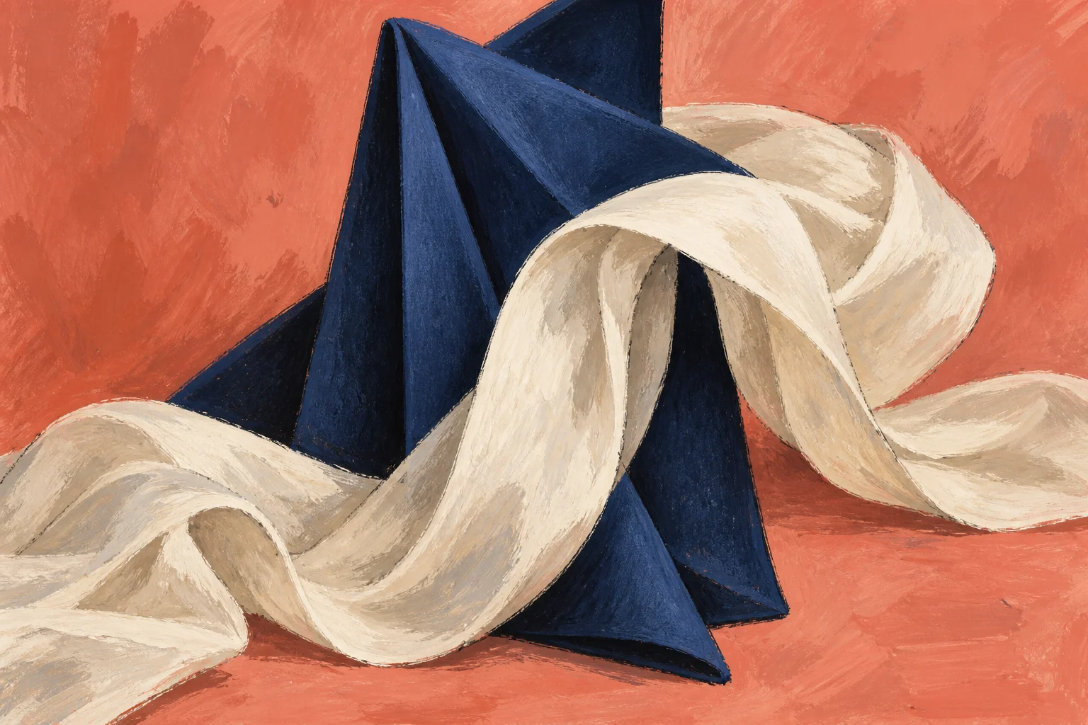
All four sources were checked September 14, 2026. Hypothetical outfit examples and the showroom application are original FashionMember analysis. No interviews, garment tests, customer research or attendance are claimed. The cover is conceptual art, not evidence of the collection.
How this story was checked
- Sources
- 4 linked records · View list
- Last verified
- Reporting desk
- FashionMember Editorial Desk
- Format
- Analysis
- AI assistance
- Used with editorial review; disclosed above.