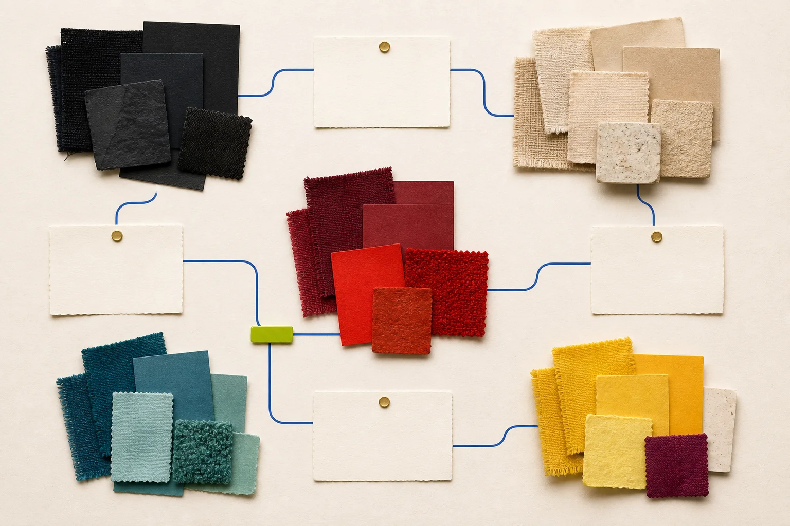
This is a test plan disguised as a trend headline. FashionMember has not interviewed buyers, inspected current market appointments, verified purchase orders, or reconciled received inventory. The five families below are a practical way to organize that research, not a statement that buyers have selected five winners.
Public collection and product pages available by September 1, 2026 provide the starting observations. Pantone’s Spring/Summer 2027 planner offers a commercial forecast framework, while brands describe or list dark neutrals, material neutrals, reds, greens and blues, and concentrated accents. Forecasts and brand palettes are inputs. Independent buying evidence must come later.
Family one: calibrated darks
Black is not one commercial color. Ink, charcoal, soot, soft black, blue-black, and dark gray can behave differently across fibers, finishes, and lighting. Chanel’s current handbag catalog includes black, gray, and dark variations across different materials. Ralph Lauren’s Spring 2026 occasion edit uses a black, white, and red palette. These are first-party examples, not buyer counts.
The research question is whether buyers are expanding dark assortments through surface and undertone rather than adding more nominal “black.” Record the supplier color name and a standardized physical reference where authorized, then photograph the sample under controlled conditions. Keep finish separate: matte suede, glossy leather, washed cotton, and sequins can all make the same nominal color read differently.
Do not merge black and navy because a screen image looks close. The exact product, material, dye or finish, and approved swatch determine the record.
Family two: material neutrals
Ecru, canvas, raffia, sand, oatmeal, stone, taupe, and warm gray often derive their meaning from material. Chanel’s current pages describe ecru canvas, beige shearling and raffia, brown leather, and other material-specific neutrals. Loewe’s recent pages foreground leather and textured constructions whose color cannot be separated from surface.
This family tests whether buyers are using neutrals to emphasize hand, construction, and wardrobe compatibility. It should not become a claim that neutrals are inherently sustainable, timeless, or easier to sell.
Code undertone, depth, material, texture, opacity, and care. Ask buyers what role the neutral plays: core replenishment, seasonal bridge, material story, occasion, or display balance. A large neutral buy may reflect basic continuity rather than a new trend.
Family three: wine through poppy red
Dior’s Cruise 2027 collection uses the California poppy as a recurring reference. Chanel’s current catalog gives burgundy a prominent role in a Fall/Winter 2026 precollection and lists red across materials and forms. Ralph Lauren’s Spring 2026 occasion edit names red within its palette.
These examples support a wide family, not one exact hue. Separate dark wine, oxblood, brick, true red, scarlet, and orange-red. A buyer may treat them as different commercial jobs: a dark continuity color, an occasion accent, a holiday story, or a warm-weather signal.
Red is especially vulnerable to screen variation and naming inconsistency. A listing that says “burgundy” while the approved sample reads brown or purple can produce expectation failures. Product data, landing page, image, label, and physical sample should agree as closely as the workflow allows.
Family four: aquatic blues and greens
Pantone’s public description of its Spring/Summer 2027 planner references movement from ocean depths to expansive imagined spaces, but the paid product—not the public summary—contains its complete proprietary directives. FashionMember does not reproduce or claim access to that paid forecast.
Loewe’s public collection pages use vivid color and elemental color framing, while Chanel’s Coco Beach 2026 product pages include green, yellow, blue, orange, and beige in raffia products. These first-party examples make blue-green families worth testing across water, mineral, utility, and sport references.
The family needs disciplined boundaries. Teal, aqua, cobalt, marine blue, olive, and forest green should not be collapsed merely because a mood board needs five columns. Let buyer language and physical swatches determine whether the family should split.
Family five: concentrated accents
Louis Vuitton’s Cruise 2027 presentation mentions chromatic pops and concentrated plum in its beauty context. Loewe describes bold colors and color statements. Chanel and Dior show yellow, orange, floral, and sequined accents in current first-party materials. Together they suggest a test category for concentrated color used in smaller visual doses.
Possible subgroups include citrus yellow, acid green, vivid orange, saturated pink, and concentrated plum. The category should measure placement as well as count. One accent trim is not equivalent to a full garment or bag. Record dominant color, secondary colors, proportion, material, category, and variant availability.
“Accent” is a merchandising role, not a universal property. A color that accents one assortment may be a core color for another community or brand.
How to verify what buyers are testing
Start with a defined sample of independent retailers, showrooms, categories, price tiers, geographies, and market dates. Obtain permission for any nonpublic information. Interview buyers using the same questions and distinguish:
- colors observed or saved;
- samples requested;
- colors considered;
- purchase orders placed;
- orders accepted or canceled;
- inventory received;
- units made available;
- full-price sales and transfers;
- completed returns and reasons; and
- reorders.
A buyer’s verbal enthusiasm is not an order. An order is not a receipt. A receipt is not consumer demand. Keep each stage and denominator visible.
For assortment counts, use stable product and variant IDs. Count a five-color style as five color variants when the question concerns color exposure, but as one style when the question concerns silhouette breadth. State which denominator is used.
Color evidence is physical and digital
Google Merchant Center’s current guidance requires or recommends recognizable color values for apparel and emphasizes consistency across product data and landing pages. It advises against numeric-only color values in the customer-facing color field. These requirements help systems identify products; they do not replace an internal color standard.
Preserve a physical standard under controlled light, supplier and retailer names, device and image workflow, and the access date. Explain that screens vary. For patterned or multicolor products, document dominant and accent order rather than using an unhelpful catch-all.
Test colorfastness and transfer only with an appropriate method and exact product sample. A visual swatch does not establish performance. Accessibility review should ensure that selection, stock, error states, and charts do not rely on color alone; labels and patterns or symbols can carry the distinction.
A buyer test for the five color families
FashionMember created four invented evidence packets in content/data/FM-101-color-family-audit.json. The script scripts/fm101-color-family-audit.php checks whether a fictional packet documents source dates, forecast source, family definitions, color standards, screen/physical limits, an authorized retail sample, buyer interviews, product identity, variant counts, inventory, orders and receipts, completed returns, colorfastness, accessibility, two coders, a human editor, ownership, and complete swatch arithmetic.
Two complete fictional packets reach color-review; two remain on hold. Every family, swatch, retailer, buyer, product, order, return, owner, and result is fictional. The result is not a forecast, buyer test, purchase order, inventory receipt, demand finding, ranking, or publication approval.
Publish the questions before the winners
Calibrated darks, material neutrals, wine-to-poppy reds, aquatic blues and greens, and concentrated accents provide a useful field guide for the next buyer study. They are broad enough to organize observation and specific enough to expose disagreements.
FashionMember should not turn them into a ranked palette until direct buyers, authorized assortments, physical standards, received inventory, and completed returns support the claim. The most credible color report may show that stores define the families differently. That disagreement is evidence too.
Sources and verification
- Pantone: PANTONEVIEW Colour Planner Spring/Summer 2027 — public product description of a paid forecast; FashionMember does not reproduce proprietary directives.
- Dior: Cruise 2027 Show — first-party poppy and collection palette context; not buyer evidence.
- Chanel: Handbags — current first-party colors and materials; dynamic availability and not an independent sample.
- Chanel: Cruise 2025/26 Style Inspirations — first-party color and material styling examples; an earlier-season context source.
- Loewe: Fall/Winter 2026 Campaign — first-party bold-color and construction framing.
- Loewe: Spring/Summer 2026 Women’s Runway — first-party color and craft context.
- Louis Vuitton: Cruise 2027 Show — first-party chromatic framing; not an assortment or sales sample.
- Ralph Lauren Collection: Spring 2026 — current first-party occasion palette; not buyer evidence.
- Google Merchant Center: Color Attribute — current official customer-facing color-data guidance.
- Google Merchant Center: Clothing and Accessories Best Practices — current first-party color-name consistency guidance.
- W3C WAI: Images Tutorial — authoritative image and non-color-dependent communication guidance.
How this story was checked
- Sources
- 11 linked records · View list
- Last verified
- Reporting desk
- FashionMember Editorial Desk
- Format
- Analysis
- AI assistance
- Used with editorial review; disclosed above.